A field book
How I Made the
TTT Keyboard
A keyboard for a man who would rather talk than type — dictated into existence while walking, cooking and editing, by the keyboard it was becoming. This is the record: where it came from, what went wrong, and what every row on the screen actually does.
One
The lineage
Three keyboards, three answers to the same question. Nothing here was built from nothing.
Go back far enough and this keyboard is the Android Open Source Project’s own soft keyboard — the plain grey thing that shipped on phones nobody remembers. Old, written in Java, largely abandoned. Everything below is what people did with that inheritance.
FlorisBoard — a keyboard that owes you nothing
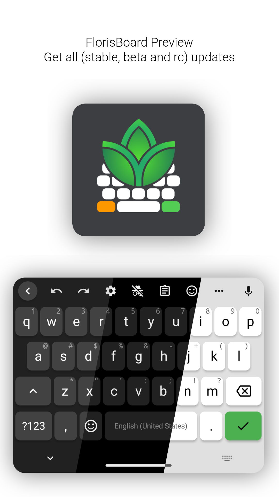
FlorisBoard rewrote that inheritance in Kotlin and Jetpack Compose and gave it a theming engine, a layout system, glide typing, a clipboard manager, dictionaries. Its stated aim is to be modern, user-friendly and customisable while fully respecting your privacy, and the privacy half is not decoration — it is the reason the project exists. A keyboard sees every password you type.
Its philosophy is restraint. The keyboard is a keyboard. It does its own job beautifully and declines to reach outside itself. There is one action row, and it holds keyboard things.
FlorisBoard is built the way serious open-source projects are built: contributors, review, a roadmap, a code of conduct, translations by a community. This fork was built by talking. Almost every decision in the eight hundred commits below arrived as a voice message, dictated while doing something else — walking, cooking, editing video at the studio, waiting somewhere — and transcribed by an earlier version of the very keyboard it was describing.
That is worth saying plainly, because it explains the shape of what follows. Nothing here was designed at a desk. Each feature was asked for at the moment it was missed, in the middle of the task where its absence hurt, and the answer arrived before the next task. The keyboard was built by the method the keyboard exists to enable, which is either the best argument for it or an admission that its author had no other choice.
Dictate — the microphone
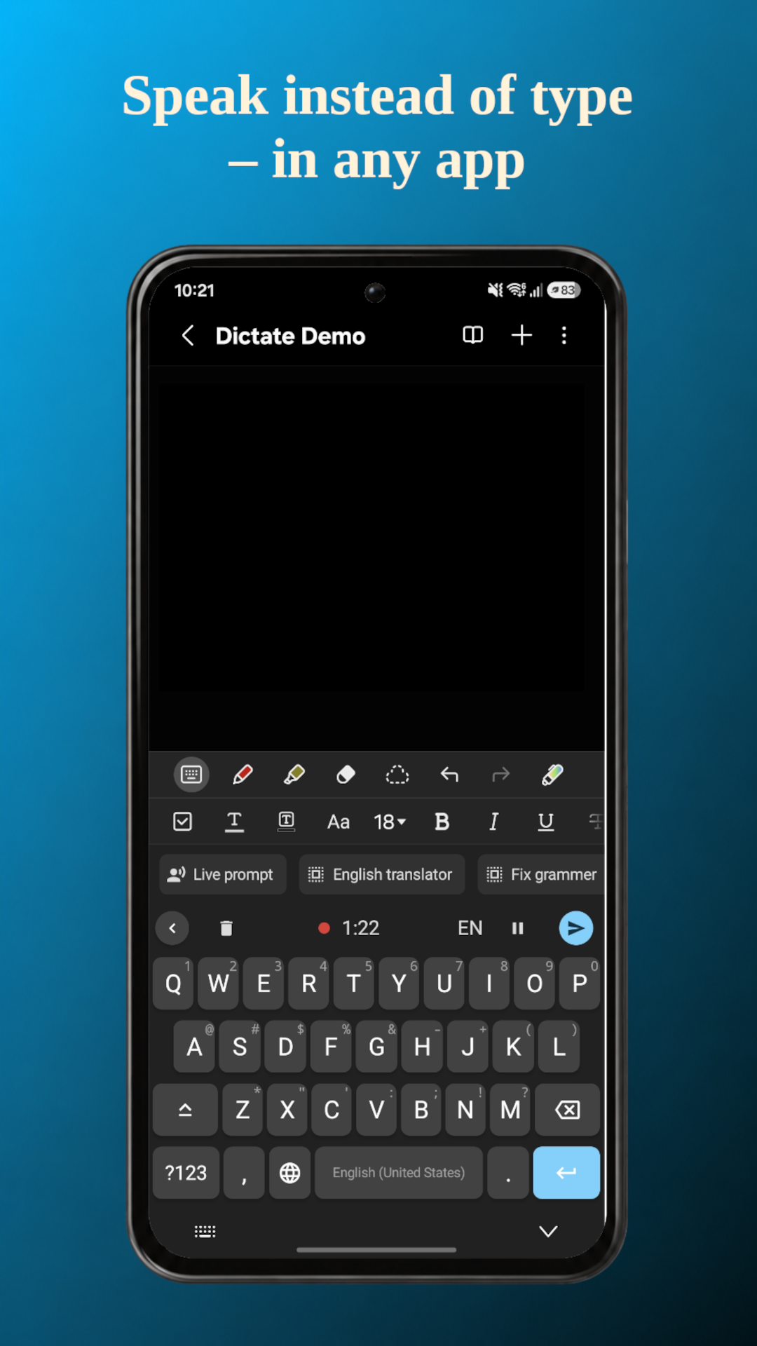
DevEmperor forked FlorisBoard and added the thing it deliberately lacked: a microphone key that records, sends the audio to a transcription service, and types the answer back. Dictate is also a complete typing keyboard — glide typing, forty languages of dictionaries, autocorrect that judges from where your fingers landed rather than from the finished word.
Its philosophy is addition. Take an excellent keyboard and give it a voice, without taking anything away. Look at that banner and you can see this keyboard’s bones: the recording bar, the running timer, the language badge, the send button. Most of what TTT mini looks like, Dictate decided.
TTT mini — one man, two languages, no compromise
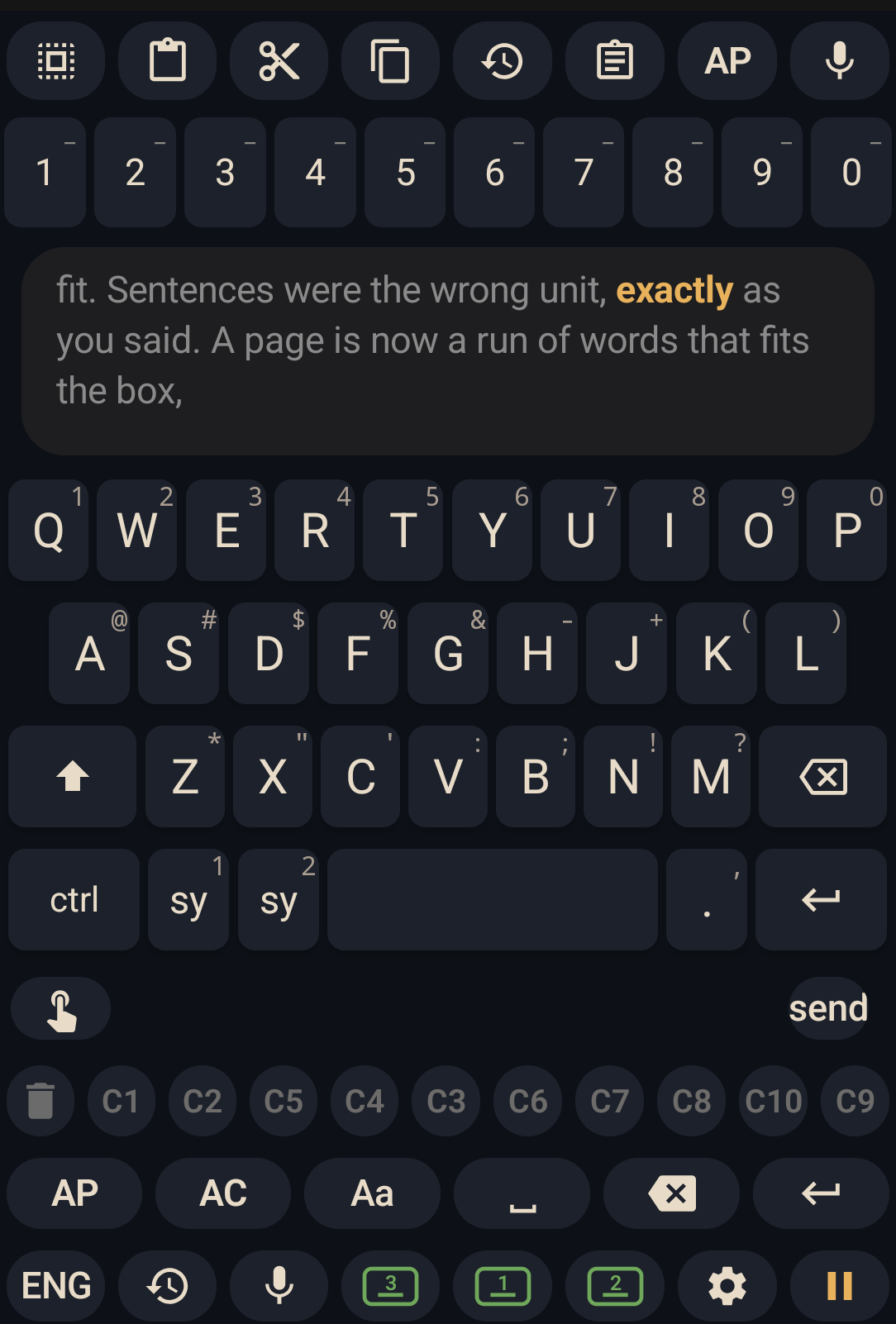
Put the three images side by side and the difference is not features, it is who each one is for.
FlorisBoard is built for everybody, which means it must be safe, general, and unsurprising. Dictate is built for anyone who would rather speak, which is a smaller room but still a crowd. TTT mini is built for one man, and that is not modesty — it is the whole design constraint.
A keyboard for everybody cannot put ten copy buckets on the screen. A keyboard for one man can, because he knows what all ten are for. It can reach out and press buttons in other applications, because he accepts that this breaks when those applications change. It can decide that red is forbidden, that the number row must survive the letters being folded away, that a spoken “dot” ends a sentence — all decisions that would be wrong in a keyboard with a million users and are simply correct in a keyboard with one.
The debt runs one way. FlorisBoard gave a real keyboard and a licence that permitted all of this; Dictate gave the microphone and the shape. What follows is only what happened afterwards.
Two
The problem
Why a man with a perfectly good keyboard needed a different one.
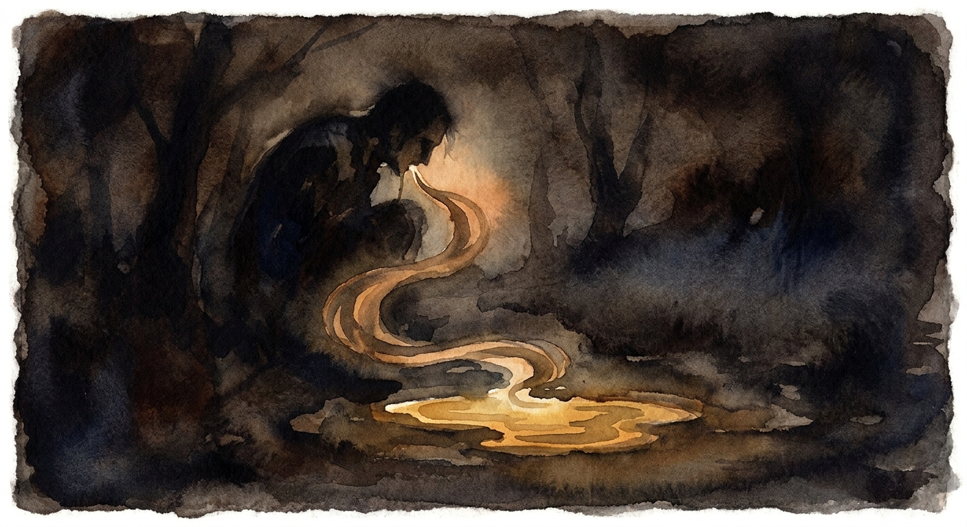
Marko is a filmmaker and a percussionist with low vision and dyslexia. He thinks out loud, fast, in two languages, often at four in the morning when an idea arrives. Typing is a bottleneck; dictation is not.
But dictation on a phone is a chain of small humiliations. You speak, and it hears the wrong language. You speak a paragraph, and the app decides you have finished halfway through. You get a transcription and now you must find the send button, which is somewhere your thumb is not. You copy a piece of code and the next copy destroys it. You tap into the middle of a word to fix it and the correction lands as a fragment.
None of those are transcription problems. They are what happens around the transcription, and that is what most of this keyboard is: the handling either side of the microphone.
Three
The rows
The screen is bands of function stacked on a keyboard. Here is every one of them.
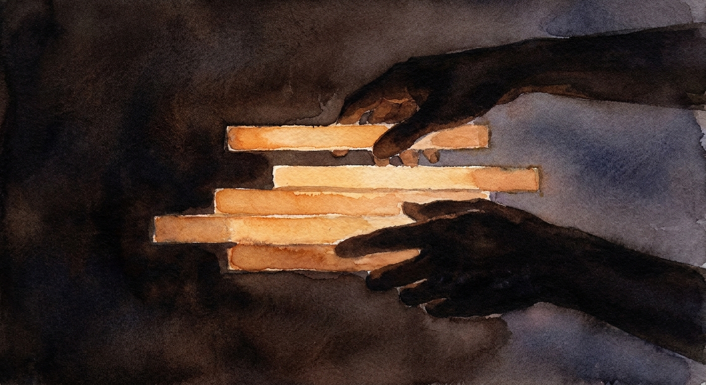
Read the keyboard from the top down and each band is doing a different job.
The status line. The top strip always says what just happened: the recorder while recording, word suggestions while typing, the bucket legend when the buckets hold something, and the clipboard when nothing else claims it. It resolves in that order, and each tier only speaks when the one above it has nothing to say.
The number row. Ten digits, independent of the letters. It was gated on the keyboard for months, which meant the key that switched it did nothing whenever the letters were folded away — a switch that silently fails in the state where it is most wanted.
The subtitle row. Only present while the voice is reading, showing the passage with the spoken word lit. It draws nothing at all when nothing is being read, so it costs no space the rest of the time.
The feature rows. Three of them, each holding any keys you like, in any order.
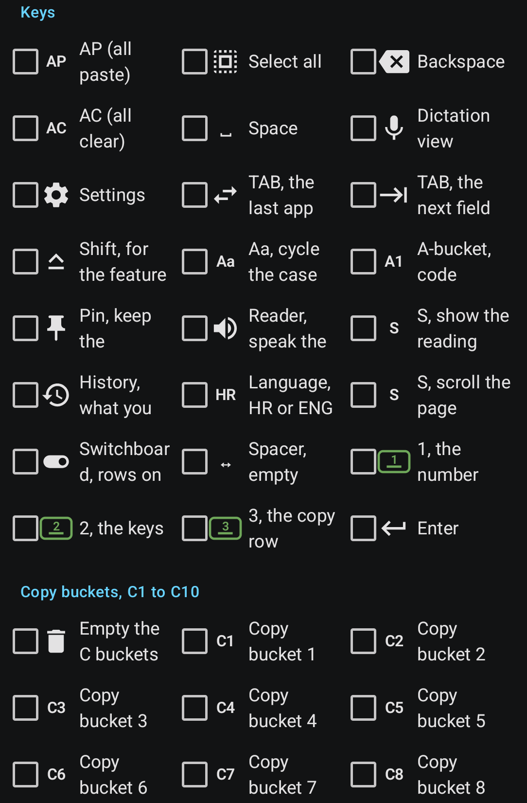
The copy buckets, C1 to C10. A phone clipboard holds one thing. Copy a second and the first is gone. The buckets hold ten: each copy fills the next free one, and each key pastes its own. The bin empties them all.
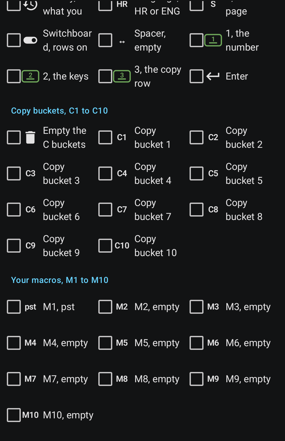
The macros, M1 to M10. Any text you like on a key.
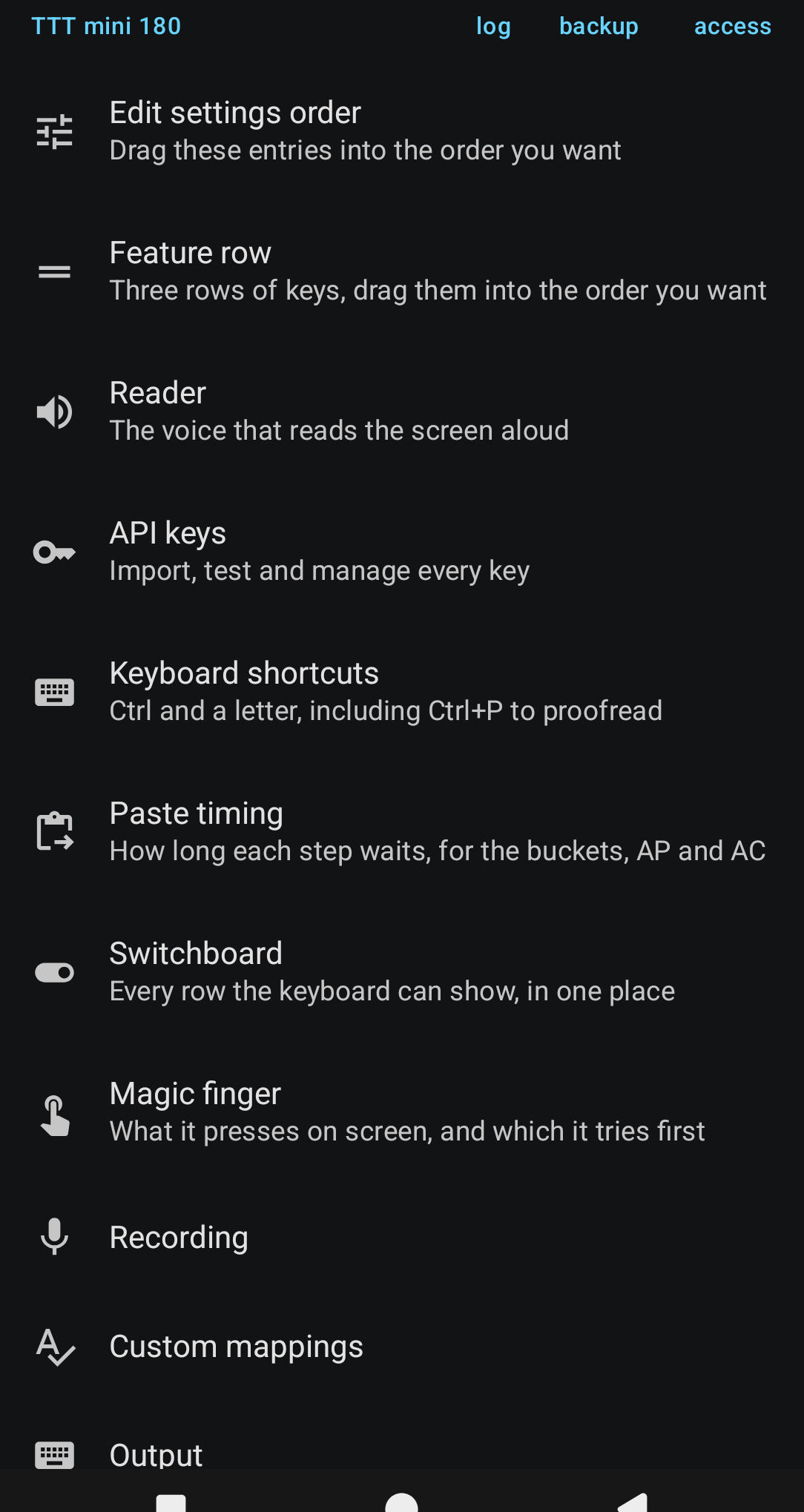
Four
The magic finger
A keyboard that reaches out and presses other applications’ buttons.
Dictation ends with a send button, and the send button is never where the thumb is. So the keyboard learned to press it.
It reads the screen the way a screen reader does — through Android’s accessibility tree, where every button announces a name — finds the name you taught it, and presses it. Say “press send” at the end of a sentence and the words are written and the button is pressed, in that order, because a send that fired before the words landed would send an empty message.
It works in apps that have never heard of it. That is the whole trick, and also the whole fragility: it depends on other people’s buttons having sensible names.
The hardest bug in the project lived here. Send worked in Claude and silently failed in Gemini, and it was not the name. Gemini wraps its send button in a container whose internal id happens to contain the word “send”, and that container is a few pixels taller than the button. The finger, choosing the lowest match, chose the wrapper — whose nearest pressable ancestor is the entire text field. It was tapping the box instead of the button, and had been for weeks.
The fix was not a better name. It was a rule: a name the app announces out loud beats a name found inside a programmer’s identifier. One is what a person means by a button; the other is spelling that leaked into the tree.
Five
Speaking, and being spoken to
Two languages, a probe that decides between them, and a voice that reads the screen back.
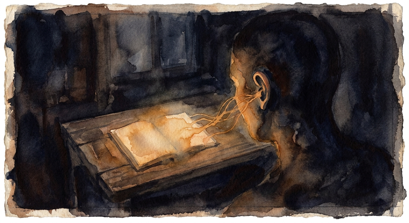
Two languages, switched mid-thought. Croatian and English, and the transcription service has to be told which before the audio is sent. Told wrongly it returns confident nonsense.
So the badge has three states: ENG, HR, and AUTO. On AUTO the first thirty seconds go to a fast Whisper for a verdict, and the verdict is clamped by a rule that is deliberately lopsided: the question asked is “is this English”, not “which language is this”. Croatian is routinely mistaken for Slovenian, Serbian, Czech or Polish; English is almost never mistaken for anything. Everything not recognisably English becomes Croatian — which also fails in the safe direction.
And if the probe fails for any reason at all, the language you set by hand stands. AUTO can only improve on the manual setting, never break it. That is what makes it safe to leave on.
Then the other direction. A speaker key reads what is on screen: the accessibility tree again, but this time filtering for prose rather than buttons. That filtering is most of the work — a screen is mostly chrome, and reading “Send”, “New chat” and “3 steps” aloud is unbearable.
Two rules do nearly all of it. Anything pressable is never read — nobody writes a paragraph inside a button. And under twelve characters is a label, not a sentence.
Six
The failures
The mistakes worth keeping, because each one left a rule behind.
The trap. A cursor trackpad shipped that closed only at the end of a drag. A finger that pressed and lifted without moving did nothing — so tapping it, which is the one thing anybody tries when stuck, did nothing at all. The keyboard was unusable until the app was force-stopped. A mode with one way in needs a way out that works when the first thing tried is doing nothing.
The whole app, broken for days. To let the volume keys work everywhere, the accessibility service asked for permission to filter key events. That is the capability a keylogger needs, so Android hid the service behind a “restricted settings” gate — and on that phone the menu item to lift the gate never appeared. The service could not be switched on at all, and everything built on it died together. The cost of asking for a capability is not a scarier dialog. It can be the whole feature and everything near it.
The detection that was right and arrived too late. Language auto-detection worked perfectly and the app still sent Croatian for English speech. The write was queued on the same thread that then read it, so the request was built from the old value. Anything that decides something and acts on it in the same breath must wait for the decision to land.
The highlight that matched by letters. The karaoke word was looked up by its text, and a passage says “the” many times, so it always lit the first one. It looked like a timing problem and no amount of tuning would ever have found it. A word’s identity is its position, not its spelling.
The reader that would not stop. A list at the bottom of a page often reports a successful scroll and does not move. Trusting that answer is what makes a reader scroll forever at the end. When something reports success, check whether anything actually changed.
Seven
The rules that survived
What eight hundred commits left behind, once the features stopped being interesting.
Settings must survive between sessions. He reinstalls several times a day. Every preference is backed up to a known folder beside the API keys, so a restore is one press and not a hunt.
One thing, one place. Send has two triggers — a key and a hardware button — and they resolve through the same list. The moment a value is copied into a second place, the two can disagree, and they will.
Red means a fault, and a full container is not one. Buckets stopped turning red when full. A recording not yet transcribed is blue, not red. Red on a screen he opens forty times a day made every visit feel like an incident.
Store what is switched OFF, not what is on. So a feature added next year is live by default, rather than invisible to anybody whose saved list predates it.
Say what was not tested. Every delivery names what remains unproven as plainly as what works. A confident report on an untested feature spends trust that has to be earned back later.
Four tests, each able to fail while the others pass. Does the logic work; does the app actually use it; what happens when the world misbehaves; and what happens to the person who already had the old version. If two of them cannot fail independently, that is three tests and a duplicate.
And the one that came last and matters most: a correct argument about a layout can still lose to where somebody’s eye already goes. The status line was moved to the bottom for good reasons and moved back for a better one — it is read a hundred times a day, and habit beats reasoning on something like that.
The keyboard is still wrong in places. It is written down where.